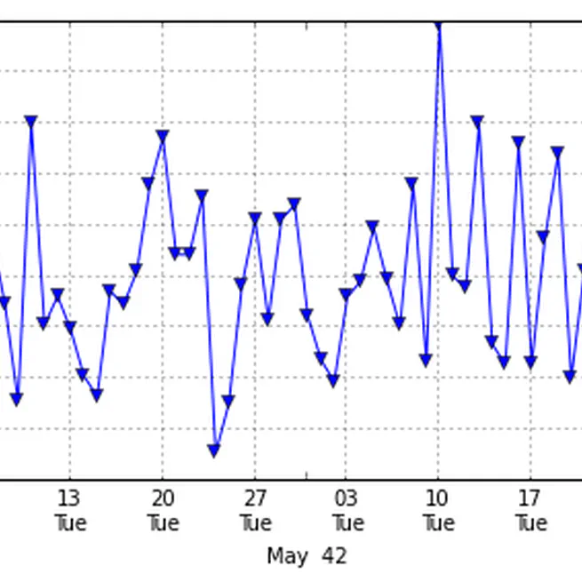
Pandas timeseries plot - setting x-axis major and minor ticks and labels
I’ve asked this question on StackOverflow (http://stackoverflow.com/questions/12945971/pandas-timeseries-plot-setting-x-axis-major-and-minor-ticks-and-labels), but couldn’t include images because I haven’t posted on stackOverflow before. So here it is, with the images. I want to be able to set the major and minor xticks and their labels for a time series graph plotted from a Pandas time series object.
Oct 18, 2012

Hearing the Unseen
This is based on a Poster/Demo presented at the “Humanities + Digital Visual Interpretations Conference” hosted by HyperStudio - Digital Humanities at MIT 20-22 May 2010. Ear diagram Barry Moon Arizona State University Brenda Moon The Australian National University This project started as a exploration of data sonification techniques. The abstract published in the conference program is a testament to this. As it progressed, the idea of using real-time data to create a game for mobile devices became more alluring. More specifically, a game where sound plays a major role in decision making, or even a game that produces interesting music with minimal interaction. For this application, the meanings of the data become far less important than its trends and time basis. We are using stock market data which wakes up and goes to sleep at fixed times of the day. Music, being predominantly time based, suits this kind of predictable framework upon which to drape its material. Although the creation of a game is the direction our sonification research has taken us, similar techniques could be applied to data to not only reveal details, but make the exploration of those details interesting and fun.
Jul 19, 2010